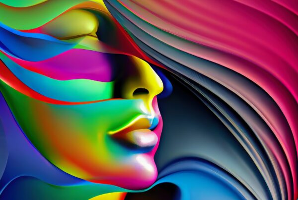
The Spectrum of Influence: Unraveling Color Psychology in Personal Branding
Welcome to Hue12 Studios, where we draw inspiration from the richness of the color wheel, encompassing primary, secondary, and tertiary colors. We believe in the power of color and its ability to shape perceptions and trigger emotions. Today, we delve deep into the realm of color psychology, investigating its role in personal branding and the impact it can have on something as pivotal as your headshot.
What is Color Psychology?
Color psychology is the study of how colors influence our moods, behaviors, and decision-making processes. Different shades and tints can evoke varied responses, and understanding these nuances can play a significant role in successful personal branding.
The Power of Color Psychology in Personal Branding
In marketing oneself, the colors you choose for your personal brand or headshot can speak volumes about who you are, your values, and your uniqueness. Colors can shape people’s perceptions of you, triggering emotions, and memories that can create a lasting impact.
Now, let’s dive into the vibrant world of specific colors, their pros, cons, shades, tints, and real-world examples:
Red
Pros: Red, a bold color, signals passion and power, often stimulating enthusiasm and excitement.
Cons: Conversely, red can also be associated with aggression or danger.
Variations: Lighter tints like pink suggest softness and femininity, while darker shades like maroon offer a more controlled, elegant energy.
Corporate Example: Target uses a vibrant red to convey excitement and immediacy in its customer experience.
Brown
Pros: Brown, reminiscent of the earth, communicates stability, reliability, and comfort.
Cons: It may also be perceived as dull or lackluster.
Variations: Lighter tints like beige convey softness and versatility, while darker shades like chocolate suggest richness and depth.
Corporate Example: UPS uses brown in its branding to signify reliability and trust.
Orange
Pros: Orange, combining the energy of red and the happiness of yellow, radiates warmth and enthusiasm.
Cons: However, it can also be seen as less serious or overly flamboyant.
Variations: Light tints like peach suggest softness and comfort, while darker shades like burnt orange convey depth and sophistication.
Corporate Example: Home Depot uses a vibrant orange to symbolize friendliness and affordability.
Yellow
Pros: Yellow, the color of sunshine, communicates happiness, intellect, and energy.
Cons: However, it can also be associated with caution or cowardice.
Variations: Lighter tints like lemon suggest freshness and vitality, while deeper shades like gold convey luxury and quality.
Corporate Example: McDonald’s uses yellow in its iconic ‘Golden Arches’ logo to symbolize joy and optimism.
Pink
Pros: Pink, often associated with femininity, suggests compassion, love, and warmth.
Cons: It may also be seen as overly delicate or immature.
Variations: Light pink evokes softness and tenderness, while hot pink suggests passion and energy.
Corporate Example: Barbie uses pink to convey fun, playfulness, and femininity.
Green
Pros: Green, symbolic of nature and growth, communicates harmony, freshness, and safety.
Cons: Conversely, it can also signify envy or inexperience.
Variations: Lighter tints like mint suggest calmness and freshness, while darker shades like forest green convey richness and tranquility.
Corporate Example: Starbucks uses green to signify freshness, harmony, and environmental consciousness.
Blue
Pros: Blue, the color of the sky and sea, represents trust, loyalty, wisdom, and confidence.
Cons: However, it can also be perceived as distant or unemotional.
Variations: Light tints like sky blue suggest tranquility and softness, while darker shades like navy convey power and reliability.
Corporate Example: Facebook uses a calming blue to promote trust and dependability.
Purple
Pros: Purple, a blend of the stability of blue and the energy of red, symbolizes power, nobility, and ambition.
Cons: However, it can also be seen as pretentious or arrogant.
Variations: Light tints like lavender suggest delicacy and grace, while darker shades like plum convey depth and luxury.
Corporate Example: Hallmark uses purple to signify creativity and quality.
White
Pros: White, the color of perfection, represents purity, innocence, and simplicity.
Cons: It can also be seen as sterile, cold, or isolating.
Corporate Example: Apple uses white to signify clean design, simplicity, and innovation.
Black
Pros: Black, a powerful color, conveys elegance, formality, and mystery.
Cons: It can also symbolize death, evil, or mystery.
Corporate Example: Chanel uses black to signify luxury, sophistication, and timeless style.
Gray
Pros: Gray, a perfect neutral, represents balance, sophistication, and stability.
Cons: However, it can also be seen as emotionless, moody, or conservative.
Corporate Example: Tesla uses gray to represent innovation, sophistication, and modernity.
With all of that being said, the colors you choose for your personal branding can significantly impact how your brand is perceived. Color psychology is a powerful tool that can help you communicate more effectively and resonate more deeply with your audience. Remember, at Hue12 Studios, our mission is to help you bring your brand to life in the most vibrant and authentic way possible. So, let’s paint a picture that tells your unique story.